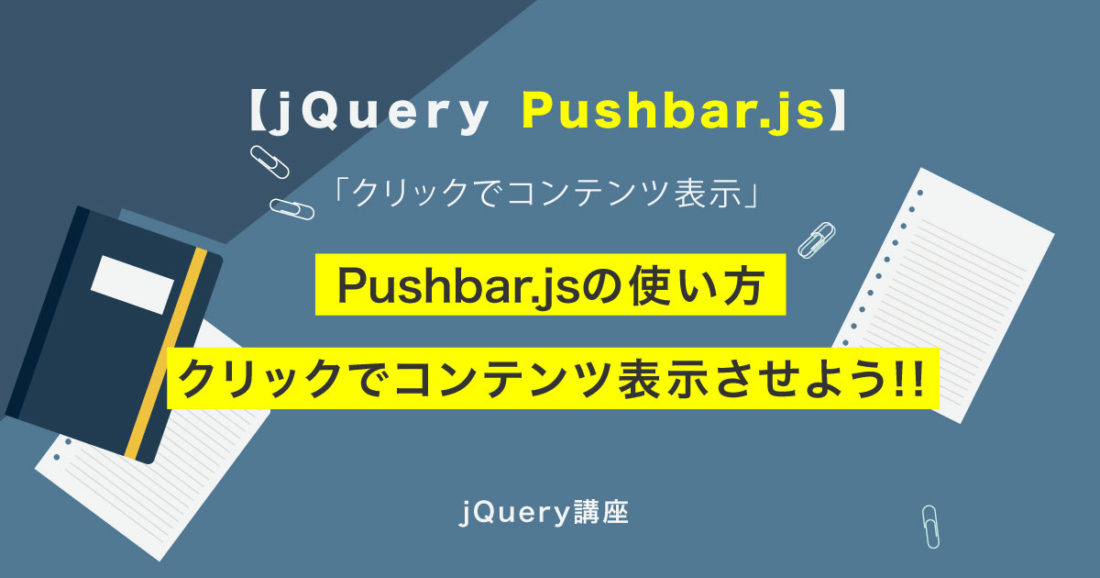
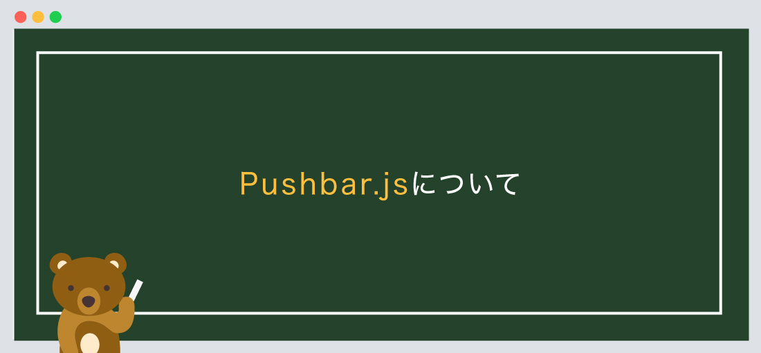
今回は【jQuery】クリックでコンテンツ表示、pushbar.jsの使い方!!
の解説になります!
こんな方に読んでほしい
- jQueryを学び始めた方へ
- プラグインのpushbar.jsを使って「クリックでコンテンツ表示」をしたい方向け
- 今回はpushbar.jsについて解説しております。
今回は、「クリックでコンテンツ表示」についての解説になります。
「pushbar.js」になりますが、今でも簡単で使いやすいプラグインになっております。
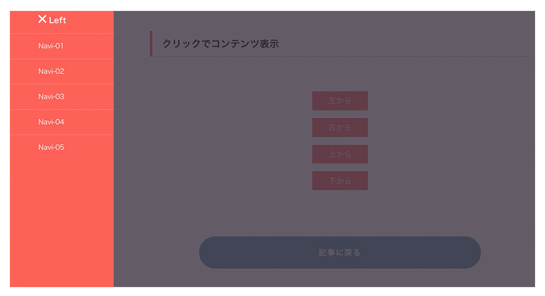
イメージ図は上記のようになります。
4方向のボタンがあり、各方向のボタンをクリックするとコンテンツが表示します。コンテンツの中身は「ナビゲーション」、「サムネイル付きのブログ」など入れる事が可能です。
下記のリンク先が公式サイトになります。
Pushbar.js公式サイトはこちらから
Pushbar.jsについて
Pushbar.jsとは、「クリックでコンテンツ表示」のことを示します。
jQueryが苦手な方でも問題ありません。
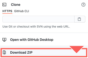
まずは下記のサイトから「Pushbar.js」をダウンロードしましょう。
必要なファイルについて
ダウンロード後に必要なファイルについて解説していきます。
まずは、ファイル名の「pushbar.js-master」をご確認ください。
- ●cssファイル
- 1「src」 > 「pushbar.css」
- ●jsファイル
- 2「src」 > 「pushbar.js」の2点を使用します。
<!--css-->
<link rel="stylesheet" href="css/pushbar.css">
<!--js-->
<script src="js/pushbar.js" type="text/javascript"></script>
また、「pushbar.js」を使用する際には、pushbarを使用する宣言をしなければなりません。
以下のコードを合わせて指定しましょう。
<!--css-->
<link rel="stylesheet" href="css/pushbar.css">
<!--js-->
<script src="js/pushbar.js" type="text/javascript"></script>
<script type="text/javascript">
	const pushbar = new Pushbar({
		blur: true,
		overlay: true,
	});
</script>
次に、jquery本体のプラグイン設置します。
今回は2つ目のパターンを採用して解説します。
● 1つ目は、ファイルをダウンロードして使用するパターン、
● 2つ目は、ファイルをダウンロードせずに、「URL」から読み込むパターンになります。
どちらでも問題ありません。
<!--js-->
<script src="https://code.jquery.com/jquery-3.5.1.min.js"></script>
<script src="js/pushbar.js" type="text/javascript"></script>
<script type="text/javascript">
	const pushbar = new Pushbar({
		blur: true,
		overlay: true,
	});
</script>
必ず、jquery本体のプラグイン上、pushbarを下に設置しましょう。
jqueryをダウンロードしたい方は、こちらのリンクから。
記述場所について
基本的にはbody内に指定するようにしましょう。
基本構造の書き方は以下のようになります。
<!doctype html>
<html>
<head>
<meta charset="UTF-8">
<title> 【jQuery】クリックでコンテンツ表示...</title>
<!--css-->
<link rel="stylesheet" href="css/pushbar.css">
</head>
<body>

 コンテンツが入ります。

<!--js-->
<script src="https://code.jquery.com/jquery-3.5.1.min.js"></script>
<script src="js/pushbar.js" type="text/javascript"></script>
<script type="text/javascript">
	const pushbar = new Pushbar({
		blur: true,
		overlay: true,
	});
</script>
</body>
</html>
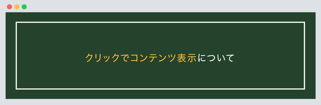
「クリックでコンテンツ表示について」の設定について
次に、「クリックでコンテンツ表示について」の設定について解説します。
「クリックでコンテンツ表示について」の設定について
デモサイトはコチラから。
基本構造の書き方は以下のようになります。
「クリックでコンテンツ表示について」

<!--左コンテンツ-->
<aside data-pushbar-id="left" data-pushbar-direction="left">
	<div class="title"><span data-pushbar-close class="close push_right"></span> Left</div>
	<ul class="menu">
		<li><a href="#">Navi-01</a></li>
		<li><a href="#">Navi-02</a></li>
		<li><a href="#">Navi-03</a></li>
		<li><a href="#">Navi-04</a></li>
		<li><a href="#">Navi-05</a></li>
	</ul>
</aside>

<!--右コンテンツ-->
<aside data-pushbar-id="right" data-pushbar-direction="right">
	<div class="title"><span data-pushbar-close class="close push_right"></span> Right</div>
</aside>

<!--上コンテンツ-->
<aside data-pushbar-id="top" data-pushbar-direction="top">
	<div class="title"><span data-pushbar-close class="close push_right"></span> Top</div>
</aside>

<!--下コンテンツ-->
<aside data-pushbar-id="bottom" data-pushbar-direction="bottom">
	<div class="title"><span data-pushbar-close class="close push_right"></span> Bottom</div>
</aside>

<!--各ボタン-->
<div class="card_content">
	<div><button data-pushbar-target="left">左から</button></div>
	<div><button data-pushbar-target="right">右から</button></div>
	<div><button data-pushbar-target="top">上から</button></div>
	<div><button data-pushbar-target="bottom">下から</button></div>
</div>
/*--CSS基本は変更 可 下記はデフォルトになります。--*/

.close {
	width: 20px;
	height: 21px;
	position: relative;
	display: inline-block;
	vertical-align: text-bottom;
	text-align: center;
	cursor: pointer;
}

.close:before, .close:after {
	position: absolute;
	left: 10px;
	content: ' ';
	height: 21px;
	width: 3px;
	background-color: #fff;
}

.close:before {
	transform: rotate(45deg);
}

.close:after {
	transform: rotate(-45deg);
}

.card {
	margin: 20px;
	border-radius: 5px;
	background: #fff;
	box-shadow: 0px 0px 20px rgba(0, 0, 0, 0.1)
}

.card_title, .title, [data-pushbar-id] {
	background: #fd6158;
	color: #fff;
}

.card_title, .title {
	font-size: 1.6rem;
	padding: 15px 20px;
	font-weight: bold;
}

.card_title {
	border-radius: 4px 4px 0px 0px;
}

.card_content {
	padding: 15px;
}

a.button.getBtn {
	margin-top: 16px;
	background-color: #fff;
	color: #4039ff;
	border-color: #fff;
}

.small {
	font-size: 14px;
	font-weight: 400;
}

.menu li {
	list-style: none;
	border-top: 1px solid rgba(255, 255, 255, 0.2);
	display: block;
	margin: 0px;
	color: rgba(255, 255, 255, 0.65);
}

.menu li a {
	font-size: 1.4rem;
	color: #fff;
	display: block;
	padding: 15px 20px;
}

.button, button, input[type='button'], input[type='reset'], input[type='submit'] {
	background-color: #fd6158;
	border: 0.1rem solid #fd6158;
	cursor: pointer;
}

button {
	font-size: 1.6rem;
	margin-top: 1em;
	padding: .4em 2em;
	color: #fff;
}

.menu li a:hover,
button:hover {background-color: #f43631;}
const pushbar = new Pushbar({
	blur: true,
	overlay: true,
});
今回は、4方向をbuttonタグを使っています。
asideで囲み、コンテンツ(ナビゲーション)を作っています。
例:左コンテンツの場合は、data-pushbar-id="left" data-pushbar-direction="left"になります。
「id=”〇〇”」、「direction=”〇〇”」は方向に合わせるようにしましょう。
注意ポイント!
今回のCSSは「pushbar.js-master」のファイルの中身の「demo.css」を変更して載せております。
ボタンのデザイン、コンテンツの背景色を変更する際には、「demo.css」を一度確認し変更して下さい。
まとめ
今回はこれで以上です。
スポンサーリンク

SHU
1991年生まれ九州の宮崎県育ち高校卒業後、愛知県で自動車関係のお仕事に5年間勤め、WEB業界に転職致しました。
趣味:サッカー観戦、ゲーム、映画、漫画基本インドアです!笑
つくる、しあわせをテーマとして主にWEBに関する様々な情報を発信しています。
最新記事
関連記事


