今回は「 【CSS】border-radiusを使用し角丸に挑戦!」をテーマにしております。
前回のテーマ「border」と組み合わせ使用してみましょう!
こんな方に読んでほしい
- CSSを学び始めた方へ
-
border-radius要素の記述方法について分からない方へ - 画像に
border-radiusを指定しましょう。簡単アニメーションにチャレンジ
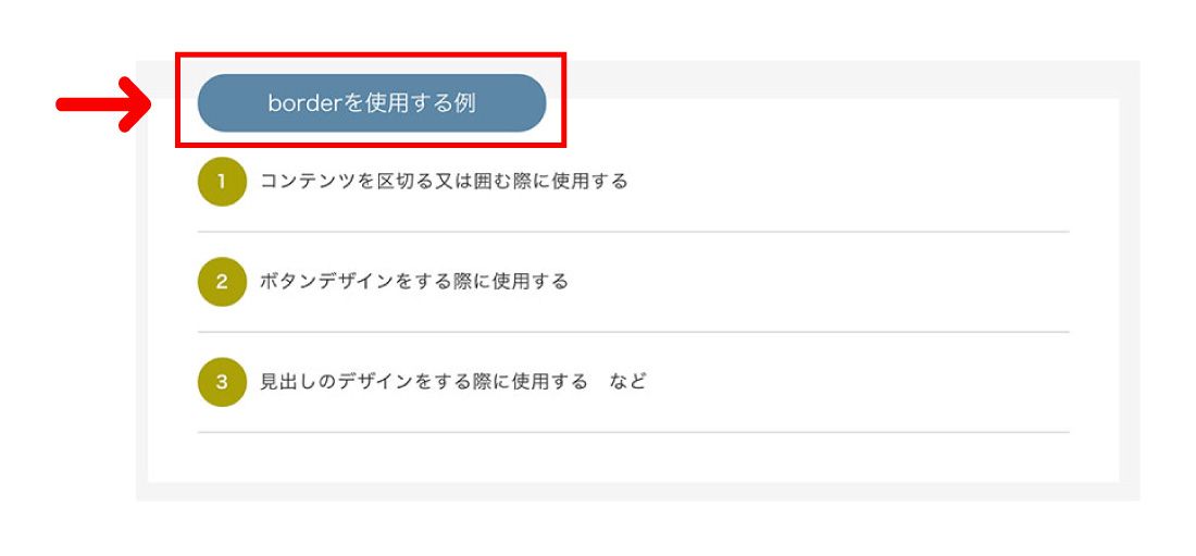
border-radiusとはどのように使用されているのか
- radiusを使用する例
- 1コンテンツを角丸にする際に使用する
- 2ボタンデザインを角丸にする際に使用する
- 3画像を角丸にする際に使用する など
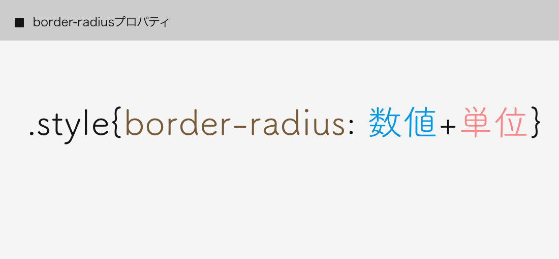
border-radiusの使い方
border-radiusの基本的な書き方は、
数値+単位を指定します。
<div class="radius">border-radius</div>
.radius {
     display:block;
     width: 240px;
     height:60px;
     line-height: 60px;
     text-align: center;
     margin: 50px auto;
     border: solid 5px #5e88a9;

     border-radius: 20px; /*--border-radius指定--*/
}
See the Pen
xxGdPaQ by shu (@shu0325)
on CodePen.
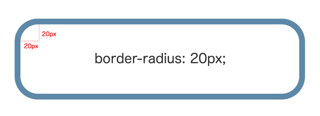
全体を角丸にしたい場合は
border-radius: 20px; と指定します。
半径20pxの正円の円弧を基準とし上下左右に指定されます。
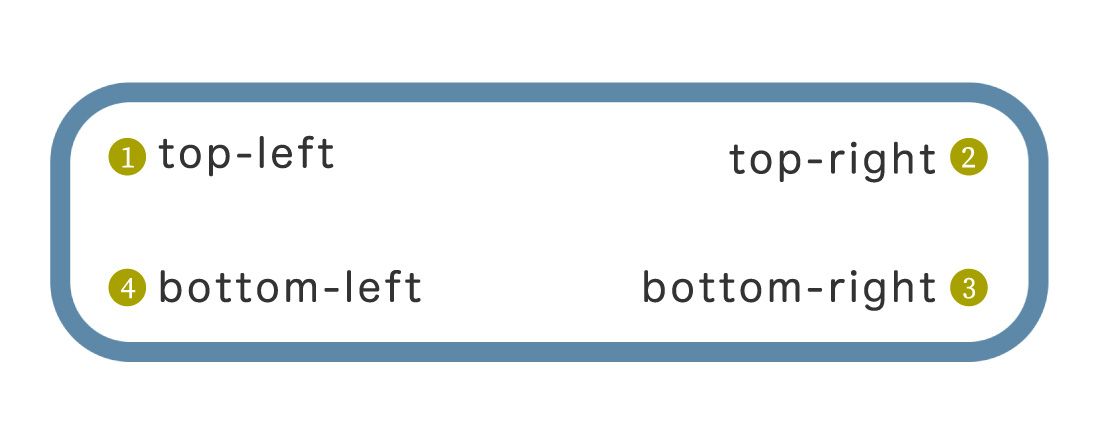
border-radiusを上下左右に使用する指定方法
{ border-radius: 左上 右上 右下 左下;}
左上を基準に時計回りに指定ができます。
See the Pen
KKpmZpQ by shu (@shu0325)
on CodePen.
コードを見る
<p class="radius01 b_main">01:角丸(左上)のみ指定</p>
<p class="radius02 b_main">02:角丸(右上)のみ指定</p>
<p class="radius03 b_main">03:角丸(右下)のみ指定</p>
<p class="radius04 b_main">04:角丸(左下)のみ指定</p>
<p class="radius05 b_main">05:角丸(左上、右上)のみ指定</p>
<p class="radius06 b_main">06:角丸(左下、右下)のみ指定</p>
.b_main {
  display:block;
  width: 280px;
  height:60px;
  line-height: 60px;
  color: #333333;
  text-align: center;
  background-color: #e2d0b6;
  margin: 30px auto;
  border: solid 5px #5e88a9;
}

.radius01 {
  border-top-left-radius: 30px; /*--01:角丸(左上)のみ指定--*/
}

.radius02 {
  border-top-right-radius: 20px; /*--02:角丸(右上)のみ指定--*/
}

.radius03 {
  border-bottom-right-radius: 20px; /*--03:角丸(右下)のみ指定--*/
}

.radius04 {
  border-bottom-left-radius: 20px; /*--04:角丸(左下)のみ指定--*/
}

.radius05 {
  border-top-left-radius: 30px;
  border-top-right-radius: 30px; /*--05:角丸(左上、右上)のみ指定--*/
}

.radius06 {
  border-bottom-left-radius: 20px;
  border-bottom-right-radius: 20px; /*--06:角丸(左下、右下)のみ指定--*/
}


少し覚えるのが大変そう….
一括指定(ショートハンド)はないのかな?

もちろん!
一括指定(ショートハンド)の指定方法もご説明いたします。
See the Pen
ZEGKvpq by shu (@shu0325)
on CodePen.
.radius01 {
  /*--50px(左上) 10px(右上) 50px(右下) 10px(左下)--*/
  border-radius: 50px 10px 50px 10px;
}
この方が簡単だね!今度からこのように指定しようかな!
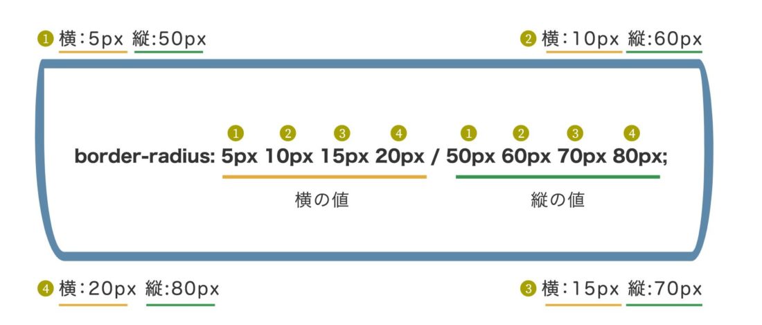
角丸をさらに詳細に指定する方法。横の値 縦の値
「/」を挟み、前の値は横の値、後ろの値は縦の値です。
See the Pen
poJPpGG by shu (@shu0325)
on CodePen.
.radius01 {
  /*--横の値(5px 10px 15px 20px) / 縦の値(50px 60px 70px 80px)--*/
  border-radius: 5px 10px 15px 20px / 50px 60px 70px 80px;
}
img画像にborder-radiusを指定してみよう
imgタグに、border-radiusを指定し、画像を角丸にする方法を紹介いたします。
See the Pen
GRJmQaz by shu (@shu0325)
on CodePen.
コードを見る
ul.img_list01 {
	text-align: center;
	overflow: hidden;
	margin: 60px 0;
}

ul.img_list01 li {
	margin: 0 10px;
	display: inline-block;
}

.img01 img {
  width: 150px;
  height: 150px;
  border-radius: 10px;
}

.img02 img {
  width: 150px;
  height: 150px;
  border-radius: 30px;
}

.img03 img {
  width: 150px;
  height: 150px;
  border-radius: 40px;
}

.img04 img {
  width: 150px;
  height: 150px;
  border-radius: 50%;
}
px指定しimg画像を角丸する方法
See the Pen
GRJmxmV by shu (@shu0325)
on CodePen.
.img01 img {
  width: 150px;
  height: 150px;
  border-radius: 40px;
}
See the Pen
oNXWqEm by shu (@shu0325)
on CodePen.
.img01 img {
  width: 150px;
  height: 150px;
  border-radius: 50px 10px 50px 10px;
}

.img02 img {
  width: 150px;
  height: 150px;
  border-radius: 15px 10px 35px 10px / 50px 30px 70px 80px;
}
%を指定しimg画像を角丸する方法
縦横比率が同じ(正方形)の画像
にborder-radiusを50%を指定すると正円になります。
See the Pen
wvadmxW by shu (@shu0325)
on CodePen.
.img01 img {
  width: 150px;
  height: 150px;
  border-radius: 50%;
}

.img02 img {
  width: 150px;
  height: 150px;
  border-radius: 40% 40% 50% 40%/30% 50% 50% 50%;
}
border-radiusを使用したアニメーション
See the Pen
RwPVMmN by shu (@shu0325)
on CodePen.
コードを見る
.img01 img {
  width: 150px;
  height: 150px;
  border-radius: 50%;
  -webkit-transition: all 0.3s
}

.img01 img:hover {
    width:150px;
    height:150px;
    border-radius:0px;
}

.img02 img {
  width: 150px;
  height: 150px;
  border-radius:0px;
  -webkit-transition: all 0.3s
}

.img02 img:hover {
    width:150px;
    height:150px;
    border-radius: 40% 40% 50% 40%/30% 50% 50% 50%;
}
See the Pen
mdJmLNB by shu (@shu0325)
on CodePen.
コードを見る
ul.img_list01 li img {
  border: 5px solid #5c87a6;
  animation: radius 4s linear infinite;
  width: 150px;
  height: 150px;
}

@keyframes radius {

  0% {
    border-radius: 0%;
  }

  25% {
     border-radius: 30%;
  }

  50% {
     border-radius: 50%;
  }

  75% {
   border-radius: 70%;
  }

  100% {
     border-radius: 0%;
  }
}
1冊ですべて身につくHTML & CSSとWebデザイン入門講座
まとめ
今回はWebサイト制作でよく使用される
CSSプロパティー「border-radius」の紹介でした!
関連記事
今回はWebサイト制作でよく使用されるCSSのborderについてのご説明をしております。
このページでは線の種類・線の太さ・線のカラーの基本的な指定方法について
紹介しております。
- POINT
-
border-radiusの基本的な書き方は、数値+単位を指定します。 -
border-radius左上を基準に時計回りに指定ができます。 - 角丸をさらに詳細に指定する方法には「/」を挟み、前の値は横の値、後ろの値は縦の値になります。
「border-radius」とアニメーションを組み合わせて見るのも良いとおもいます。
スポンサーリンク

SHU
1991年生まれ九州の宮崎県育ち高校卒業後、愛知県で自動車関係のお仕事に5年間勤め、WEB業界に転職致しました。
趣味:サッカー観戦、ゲーム、映画、漫画基本インドアです!笑
つくる、しあわせをテーマとして主にWEBに関する様々な情報を発信しています。
最新記事
関連記事


