今回は、「【CSS3】下からふんわり アニメーション・コピペOK」について
解説していきます。
おすすめポイント
- CSS3を使いアニメーションの動きをホームページに入れたい方
- コピペで使用可能です(最終コードは一番下に載せておきます)
- JS(jquery)などの難しい記述なし
まずは、デモサイトをご用意したので一度そちらで動きの確認のしてみてください。
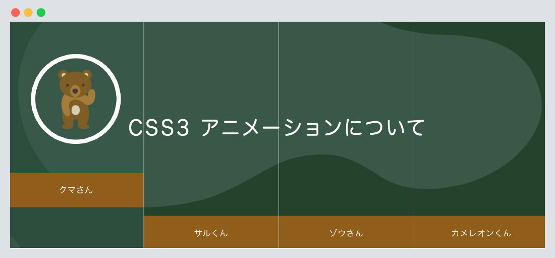
CSS3アニメーションについて
デモサイトのように「下からふんわり上に上がってくる」アニメーションを作成しましたので
ご紹介いたします。
HTML・CSSに記述について
HTMLファイル
<!--contents-->
<section class="contents">
	<h1 class="ttl"><img src="images/page/top/tti.png" alt="どうぶつたちの"/></h1>

		<!--flex main-->
		<div class="flex main">

			<!--area-->
			<div class="box area"><a href="https://shu-naka-blog.com/css/css3_animation/">
				<div class="icon"><img src="images/page/top/icon01.png" alt=""/></div>
			<p class="box_ttl">クマさん</p>
			</a></div>
			<!--/.area END-->

			<!--省略-->

		</div>
		<!--/.flex main END-->

</section>
<!--contents-->
STEP 01
全体のエリアを指定しましょう
HTMLファイル
<!--contents-->
<section class="contents">
	<h1 class="ttl"><img src="images/page/top/tti.png" alt="どうぶつたちの"/></h1>

	<!--省略-->

</section>
<!--contents-->
CSSファイル
.contents {
	padding: 50px 0 100px;
	background: url("../images/page/top/bg_top_right.png"),
		url("../images/page/top/bg_bottom_right.png"),
		url("../images/page/top/bg_left_right.png") #24422b;
	background-repeat: no-repeat;
	background-position: top right, bottom right, bottom left;
}

h1.ttl {
	width: 20%;
	margin: 0 auto 10px;
}
1. contentsタグで全体を囲い、背景色、背景画像の指定をしております。
2. h1見出しタグに画像を入れタイトルの指定をしております。
この2点に関しては、デザインのため記述したものであり、アニメーションには関係ありませんので、
必要に応じて指定してください。
STEP 02
アニメーションエリアを指定しましょう
HTMLファイル
<!--contents-->
<section class="contents">
	<h1 class="ttl"><img src="images/page/top/tti.png" alt="どうぶつたちの"/></h1>
		<!--flex main-->

		<div class="flex main">
			<!--省略-->
		</div>
		<!--/.flex main END-->

</section>
<!--contents-->
CSSファイル
.flex {
    display: flex;
    flex-wrap: wrap;
    margin: 0 -15px;
}
.main {
	width: 100%;
	margin: 0 auto;
	overflow: hidden;
	clear: both;
	background: url("../images/page/top/bg_main.png") no-repeat;
	background-size: contain;
	border-right: solid 1px rgba(255, 255, 255, 0.6);
}
@media (min-width: 1000px) {
  .main {
    max-width: 1000px;
  }
}
3. 親要素のflexに「display: flex」と「flex-wrap: wrap」を指定しましょう。
flex-wrap: wrapとは、子要素を折り返し、複数行に上から下に並べます。
4. main要素には「width」の指定、または背景画像なのを指定しております。
STEP 03
子要素の指定しましょう
HTMLファイル
<!--省略-->

		<!--flex main-->
		<div class="flex main">

			<!--area-->
			<div class="box area"><a href="https://shu-naka-blog.com/css/css3_animation/">
				<div class="icon"><img src="images/page/top/icon01.png" alt=""/></div>
			<p class="box_ttl">クマさん</p>
			</a></div>
			<!--/.area END-->

			<!--省略-->

		</div>
		<!--/.flex main END-->

<!--省略-->
CSSファイル
.box {
    border-left: 1px solid rgba(255, 255, 255, 0.6);
    margin: 0;
	box-sizing: border-box;
}

.area {
    flex: 0 0 25%;
	max-width: 25%;
}

.area a {
    height: 560px;
    position: relative;
    display: flex;
    align-items: center;
    justify-content: center;
    transition: all .3s ease;
    text-align: center;
}
5. box要素には、borderの指定をしております。
そこまで重要ではありません。
6. area要素には「flex: 25%」の指定、
area aには「height: 560px」、「transition: all .3s ease」
などの指定をしています。
ここまでを確認してみましょう。
See the Pen
XWbLzrp by shu (@shu0325)
on CodePen.
STEP 04
アイコン画像、テキストをCSSで指定しましょう
CSSファイル
/*--テキスト--*/
.area a p.box_ttl  {
    bottom: 0;
    left: 0;
    position: absolute;
    width: 100%;
    text-align: center;
    color: #ffffff;
    font-size: 16px;
    transition: all .3s ease;
    -webkit-transform: translate(0, 0px);
    transform: translate(0, 0px);
    margin: 0;
	padding: 20px 0;
	background: #8f5e13;
}

.area a:hover p.box_ttl {
  -webkit-transform: translate(0, -80px);
          transform: translate(0, -80px);
}

/*--アイコン画像--*/
.areaa img {
    width: 130px;
    height: 130px;
	padding-top: 10px;
}

.area a .icon {
    transition: opacity .3s ease;
    opacity: 0;
    display: inline-block;
    pointer-events: none;
    width: 150px;
    height: 150px;
    border-radius: 50%;
    text-align: center;
    border: 8px solid #ffffff;
    padding-top: 0;
}

.area a:hover .icon {
	opacity: 1;
}

.area a:hover {
    background: rgba(57, 88, 72, 0.5);
}
7. box_ttl要素には、hoverした際にtranslate(0, -80px)を指定し
高さの調整をおこなっております。
8. icon要素には、opacity: 0を指定し初期状態は見えなく(非表示)にしています。
以上8STEPでご説明いたしました
最後にまとめコードを載せておきます
コードを見る
HTMLファイル
<!--contents-->
<section class="contents">
	<h1 class="ttl"><img src="images/page/top/tti.png" alt="どうぶつたちの"/></h1>

		<!--flex main-->
		<div class="flex main">

			<!--area-->
			<div class="box area"><a href="https://shu-naka-blog.com/css/css3_animation/">
				<div class="icon"><img src="images/page/top/icon01.png" alt=""/></div>
			<p class="box_ttl">クマさん</p>
			</a></div>
			<!--/.area END-->

			<!--area-->
			<div class="box area"><a href="https://shu-naka-blog.com/css/css3_animation/">
				<div class="icon"><img src="images/page/top/icon02.png" alt=""/></div>
				<p class="box_ttl">サルくん</p>
			</a></div>
			<!--/.area END-->

			<!--area-->
			<div class="box area"><a href="https://shu-naka-blog.com/css/css3_animation/">
				<div class="icon"><img src="images/page/top/icon03.png" alt=""/></div>
				<p class="box_ttl">ゾウさん</p>
			</a></div>
			<!--/.area END-->

			<!--area-->
			<div class="box area"><a href="https://shu-naka-blog.com/css/css3_animation/">
				<div class="icon"><img src="images/page/top/icon04.png" alt=""/></div>
				<p class="box_ttl">カメレオンくん</p>
			</a></div>
			<!--/.area END-->

		</div>
		<!--/.flex main END-->

</section>
<!--contents-->
CSSファイル
/*--contents--*/
.contents {
	padding: 50px 0 100px;
	background: url("../images/page/top/bg_top_right.png"),
		url("../images/page/top/bg_bottom_right.png"),
		url("../images/page/top/bg_left_right.png") #24422b;
	background-repeat: no-repeat;
	background-position: top right, bottom right, bottom left;
	background-size: 20%;
}

h1.ttl {
	width: 20%;
	margin: 0 auto 50px;
}

.flex {
    display: flex;
    flex-wrap: wrap;
  margin: 0 -15px;
}

.main {
	width: 100%;
	margin: 0 auto;
	overflow: hidden;
	clear: both;
	background: url("../images/page/top/bg_main.png") no-repeat;
	background-size: contain;
	border-right: 1px solid rgba(255, 255, 255, 0.6);
}

.box {
    border-left: 1px solid rgba(255, 255, 255, 0.6);
	margin: 0;
	box-sizing: border-box;
}

.area {
    flex: 0 0 25%;
	max-width: 25%;
}

.area a {
    height: 560px;
    position: relative;
    display: flex;
    align-items: center;
    justify-content: center;
    transition: all .3s ease;
    text-align: center;
}


/*--テキスト--*/
.area a p.box_ttl  {
    bottom: 0;
    left: 0;
    position: absolute;
    width: 100%;
    text-align: center;
    color: #ffffff;
    font-size: 16px;
    transition: all .3s ease;
    -webkit-transform: translate(0, 0px);
    transform: translate(0, 0px);
    margin: 0;
	padding: 20px 0;
	background: #8f5e13;
}

.area a:hover p.box_ttl {
  -webkit-transform: translate(0, -80px);
          transform: translate(0, -80px);
}

/*--アイコン画像--*/
.areaa img {
    width: 130px;
    height: 130px;
	padding-top: 10px;
}

.area a .icon {
    transition: opacity .3s ease;
    opacity: 0;
    display: inline-block;
    pointer-events: none;
    width: 150px;
    height: 150px;
    border-radius: 50%;
    text-align: center;
    border: 8px solid #ffffff;
    padding-top: 0;
}

.area a:hover .icon {
	opacity: 1;
}

.area a:hover {
    background: rgba(57, 88, 72, 0.5);
}


@media (min-width: 1000px) {
  .main {
    max-width: 1000px;
  }
}
レスポンシブにも対応させましょう
こちらもCSSを載せておきます。コピペで使用可能です。
コードを見る
CSSファイル
@media screen and (max-width:736px) {
	h1.ttl {
		width: 60%;
		margin: 0 auto 50px;
	}

	.main {
		width: 100%;
		margin: 0 auto;
		overflow: hidden;
		clear: both;
		background: url("../images/page/top/bg_main.png") no-repeat center;
		background-size: cover;
		border-right: none;
		border-top: 1px solid rgba(255, 255, 255, 0.6);
	}

	.box {
		border-left: none;
		border-bottom: 1px solid rgba(255, 255, 255, 0.6);
	}

	.area {
		flex: 0 0 100%;
		max-width: 100%;
	}

	.area a {
		height: auto;
		padding: 20px;
		text-align: left;
		background: rgba(35, 40, 59, 0.5);
	}


	.area a .icon {
		opacity: 1;
		width: 30%;
		height: 60px;
		text-align: center;
		border: none;
		padding: 0;
	}

	.area a p.box_ttl {
		text-align: left;
		position: relative;
		top: 0;
		left: 0;
		font-weight: normal;
		font-size: 1rem;
		-webkit-transform: translate(0, 0px) !important;
		transform: translate(0, 0px) !important;
		padding-left: 20px;
	}
}
最後にデモサイトで一度確認してみてください。
まとめ
今回はこれで以上です。
- POINT
- 親要素には必ず「display: flex」と「flex-wrap: wrap」を指定しましょう。
-
translate(0, -80px)で高さの調整をおこないましょう。 -
opacity: 0を指定し初期状態は見えなくしておきましょう。
スポンサーリンク

SHU
1991年生まれ九州の宮崎県育ち高校卒業後、愛知県で自動車関係のお仕事に5年間勤め、WEB業界に転職致しました。
趣味:サッカー観戦、ゲーム、映画、漫画基本インドアです!笑
つくる、しあわせをテーマとして主にWEBに関する様々な情報を発信しています。
最新記事
関連記事


