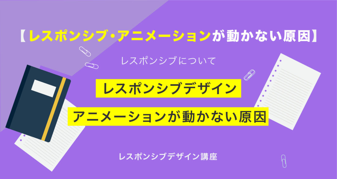
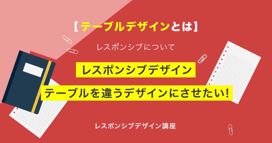
今回はレスポンシブデザイン、テーブルを違うデザインにさせたい!
こんな方に読んでほしい
- レスポンシブデザインを学び始めた方へ
- レスポンシブ講座Part05になります。
- 今回は「テーブルを違うデザインにさせる」について解説しております。
レスポンシブデザインとは、表示領域の幅によって見え方が変わるデザイン(Webサイトの見た目)のことを示します。
前回は、テーブルを横スクロールさせる!について解説しました。
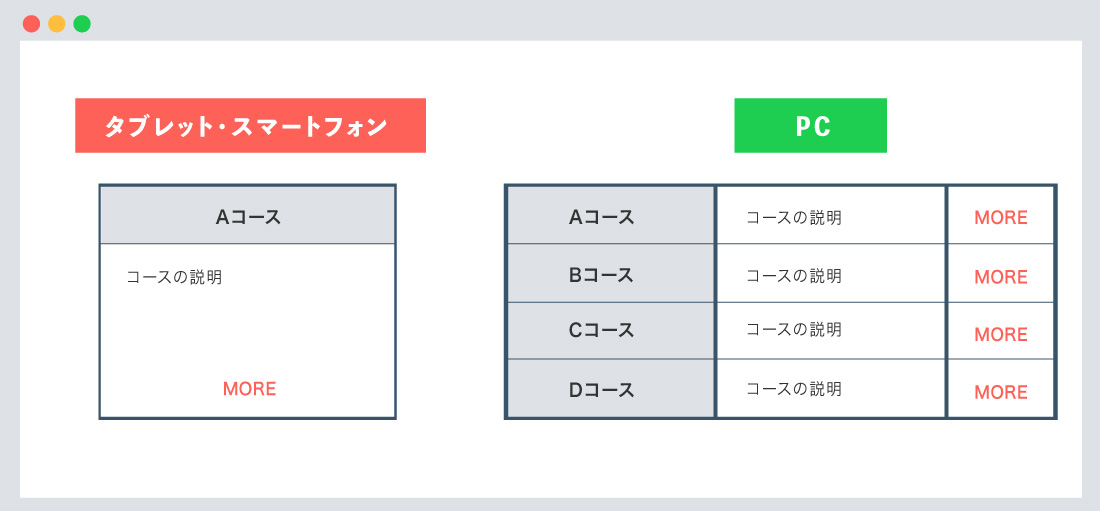
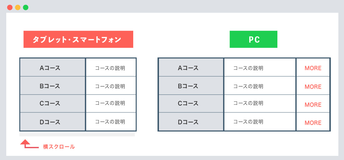
パソコン(PC)の表示は通常のテーブルを表示させ、タブレット端末、スマートフォン端末では、テーブルを横スクロールさせる、CSSを解説しております。
下記の「テーブルを横スクロールさせる!」に関する記事を理解してPart05にいきましょう。
テーブルを横スクロールさせる!
パソコン(PC)の表示は通常のテーブル、タブレット端末、スマートフォン端末では、テーブルを横スクロールさせる!!
テーブルを違うデザインにさせるについて
テーブルを作成する際に、「行2 × 列2」など、行と列が少ない場合は、スマートフォン端末でもデザインを変更させず表示させても良い場合もありますが、
行と列が多い場合は、デザインを変更して、「見やすく・読みやすく」した方が良い場合もあります。
テーブルとdisplayの関係性について
テーブルには、displayプロパティのデフォルト値が適用されています。
まずは、displayプロパティとの関係性を覚えておきましょう。
特に、tr、th / td関しては、しっかり覚えておきましょう。
| table | table |
|---|
| tr | table-row |
|---|
| th / td | table-cell |
|---|
| thead | table-header-group |
|---|
| tbody | table-row-group |
|---|
| tfoot | table-footer-group |
|---|
| caption | table-caption |
|---|
● table-rowとは、「テーブルの行のように」表示されます。
● table-cellとは、「テーブルのセルのように」表示されます。
実際のコードについて
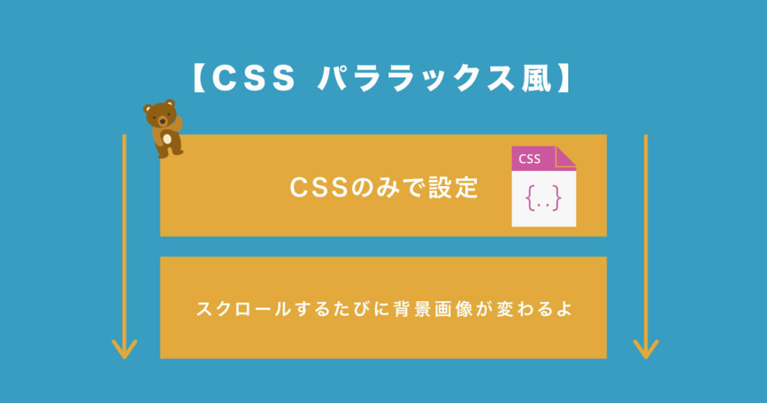
考え方としては、パソコン(PC)向けでは通常通り、table-row、 table-cellを適用させます。
タブレット端末、スマートフォン端末では、display-blockを適用させ、ブロック要素にするイメージになります。
イメージ図は下記のようになります。
横長いテーブルを縦(ブロック)にするイメージになります。
書き方は以下のようになります。
テーブルを違うデザイン

<div class="table-area">
	<table class="sp-table">
		<tbody>
			<tr>
				<th>Aコース</th>
				<td>Aコースはテキストが入ります。</td>
				<td>Aコースはテキストが入ります。</td>
				<td class="more-btn"><a href="#">詳細はこちら</a></td>
			</tr>
			<tr>
				<th>Bコース</th>
				<td>Bコースはテキストが入ります。</td>
				<td>Bコースはテキストが入ります。</td>
				<td class="more-btn"><a href="#">詳細はこちら</a></td>
			</tr>
      以下省略
		</tbody>
	</table>
</div>
/*--スマートフォン--*/
/*--メディアクエリの記述なし--*/
.table-area {
	width: 70%;
	margin: 0 auto;
}

table.sp-table-layout {
	width: 100%;
	margin: 5em auto 2em;
}

table.sp-table-layout,
table.sp-table-layout td,
table.sp-table-layout th {
	border-collapse: collapse;
}

/*--↓ 必須--*/
table.sp-table-layout,
table.sp-table-layout tbody,
table.sp-table-layout tr,
table.sp-table-layout td,
table.sp-table-layout th {
	display: block;
}

/*--↓ 下記は装飾になります--*/
table.sp-table-layout td,
table.sp-table-layout th {
	font-size: .8rem;
	padding: 1em;
	box-sizing: border-box;
	border-left: 1px solid #595959;
	border-right: 1px solid #595959;
}

table.sp-table-layout th {
	color: #333;
	background-color: #DEE1E6;
	border-top: 1px solid #595959;
}

table.sp-table-layout td.more-btn {
	margin-bottom: 2em;
	border-bottom: 1px solid #595959;
}

/*--↓ ボタン--*/
table.sp-table-layout td.more-btn a {
	color: #fff;
	display: block;
	width: 80%;
	padding: 1em 0;
	margin: 0 auto;
	text-align: center;
	background-color: #FD4E4F;
	border-radius: 30px;
}

/*--PC--*/
@media screen and (min-width: 1025px){
	/*--sp-table-layout--*/
	table.sp-table-layout,
	table.sp-table-layout tbody{
		display: table;
		border-collapse: collapse;
		width: 100%;
	}

	table.sp-table-layout tr {
		display: table-row;
	}

	table.sp-table-layout th,
	table.sp-table-layout td {
		display: table-cell;
		border: 1px solid #595959;
	}

	table.sp-table-layout td.more-btn a {width: 100%;}
}
文字サイズ、文字色や幅(width)等は調整してください。
こちらにデモサイトを用意しました。
下記からご確認ください。
関連記事
まとめ
今回はこれで以上です。
- POINT
- ※
name="viewport"の設定を忘れないように注意しましょう。 - タブレット端末、スマートフォン端末では、
display-blockを適用させます。 - PCでは、
table-row、table-cellを適用させます。 - こちらにデモサイトを用意しました。
スポンサーリンク

SHU
1991年生まれ九州の宮崎県育ち高校卒業後、愛知県で自動車関係のお仕事に5年間勤め、WEB業界に転職致しました。
趣味:サッカー観戦、ゲーム、映画、漫画基本インドアです!笑
つくる、しあわせをテーマとして主にWEBに関する様々な情報を発信しています。
最新記事
関連記事


